
To learn how to A/B test landing page elements for free, start with one clear hypothesis, test one high-impact element like your headline or CTA, split traffic between two versions, measure one main conversion goal, and keep the winning version only after you have enough data.
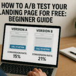
A/B testing sounds technical, but the idea is simple: show version A to one group of visitors and version B to another group, then measure which version gets more conversions. For a landing page, that conversion might be a lead generation form submission, a booked call, a free trial signup, a Shopify purchase, or a click-through rate to checkout.
In our audits of 200+ landing pages, we have found that most teams test too late or test the wrong things first. Before running split testing, start with a free CRO audit so you can fix obvious issues like weak headline clarity, poor above the fold layout, slow page speed, missing trust signals, and form friction.
This guide uses The Dreamer Designs 8-Step Landing Page A/B Testing Framework to help beginners run smarter tests without wasting traffic.
What Is Landing Page A/B Testing?
Landing page A/B testing is the process of comparing two versions of a landing page to see which one produces more conversions.
Version A is usually your current page, also called the control. Version B is the variation, which changes one element such as the headline, CTA copy, hero image, form length, social proof placement, or urgency message. The goal is to learn which version performs better based on user behavior, not opinions.
A/B testing is different from multivariate testing. A/B testing compares two versions of a page or page element. Multivariate testing compares several combinations of elements at once, which usually requires much more traffic. For most beginners, A/B testing is the safer first step.
VWO defines A/B testing as comparing two versions of a webpage or app to identify the better performer using real data instead of guessing. That is exactly why landing page optimization teams use testing: it turns design debates into measurable decisions.
A landing page test can measure:
Form submissions
Button clicks
Purchases
Demo bookings
Trial signups
Add-to-cart actions
Scroll depth
Bounce rate
Revenue per visitor
The best A/B tests do not ask, “Which version looks better?” They ask, “Which version gets more of the right visitors to take the right action?”
For a stronger starting point, use a conversion rate optimization tool to identify the biggest conversion funnel issues before you build your first test.
How to A/B Test Landing Page Elements for Free
You can A/B test landing page elements for free by choosing one hypothesis, creating two page versions, splitting traffic, tracking one primary conversion goal, and analyzing the result after enough visitors have seen both versions.
Free testing does not mean careless testing. It means using a simple process, free CRO tools, and clear decision rules before paying for advanced software.
1. Start With a Free CRO Audit Before Testing
A free CRO audit helps you decide what to test first instead of guessing.
Many teams jump into A/B testing because they want a quick conversion lift. The problem is that testing a weak idea wastes traffic. If your page has a vague headline, hidden call to action, slow load time, or broken mobile form, you do not need a test yet. You need a fix.
Start by reviewing your page for:
Headline clarity
Above the fold layout
CTA visibility
Page speed
Mobile optimization
Trust signals
Social proof
Form friction
Message match
Heatmap behavior
In our analysis of 200+ landing pages, we found that the best first tests often come from obvious friction: unclear CTA copy, weak proof near the form, or a hero section that does not match the ad promise.
Quick-win fix: run a free landing page audit first, then choose one issue that affects every visitor.
2. Pick One Primary Conversion Goal
Every A/B test needs one main success metric.
Your primary goal is the action that decides whether the test won or lost. For a lead generation page, that may be form submissions. For a SaaS page, it may be free trial signups. For ecommerce, it may be purchases or add-to-cart actions. For a webinar page, it may be registrations.
Do not judge one test by five different goals at once. If version B gets more button clicks but fewer qualified leads, did it really win? That depends on your primary goal.
Use Google Analytics 4 to track the main event. GA4 allows businesses to create and modify events so they can measure the actions that matter on a website or app.
Quick-win fix: define the test goal in one sentence: “This test wins if version B increases completed form submissions without lowering lead quality.”
This keeps your landing page A/B testing clean and prevents your team from choosing the version they personally like.
3. Test Headline-Ad Message Match First
Headline-ad message match is often the best first test because every visitor sees the headline before deciding whether to stay.
Message match means the landing page headline reflects the promise, offer, or search intent that brought the user there. If your ad says “free CRO audit” but the page headline says “Scale Smarter With Better Design,” users may feel like they landed in the wrong place.
For search traffic, match the headline to the query. For paid traffic, match it to the ad. For email traffic, match it to the subject line or CTA.
Strong headline test ideas include:
Benefit headline vs. feature headline
Specific audience headline vs. broad headline
Problem-focused headline vs. outcome-focused headline
Keyword-matched headline vs. brand-style headline
Quick-win fix: create a variation that uses the exact phrase your visitor expects. If the campaign promise is “A/B test landing page free,” include that idea clearly in the headline or subheadline.
Pull-quote stat: In our audits of 200+ landing pages, unclear headline-ad message match was one of the most common issues we saw on low-performing paid traffic pages.
4. Test CTA Copy Before Button Color
CTA copy usually matters more than button color because it tells users what happens next.
A call to action should reduce uncertainty. Generic copy like “Submit,” “Learn More,” or “Get Started” may work in some cases, but it often misses a chance to restate value.
Better CTA variations include:
“Get My Free Audit”
“See My CRO Score”
“Book My Free Strategy Call”
“Start My Free Trial”
“Get the Landing Page Checklist”
“Create My Test Plan”
HubSpot’s CTA performance guidance focuses on tracking views, clicks, and submissions, which is useful because a CTA can be visible but still underperform if the copy does not make the next step clear.
Quick-win fix: test your current CTA against one value-based CTA. Keep the button color and placement the same so you know the copy caused the change.
If your CTA still underperforms after copy testing, review surrounding trust signals, form friction, and page layout.
5. Test Hero Image vs. Video
Hero visuals can change how quickly visitors understand your offer.
A static image is often better for speed, simplicity, and clear product context. A video can work better when your product needs explanation, your offer benefits from a founder message, or your service requires trust before action.
The wrong visual can hurt conversions. A large video may slow page speed. A generic stock photo may fail to build trust. A dashboard screenshot may be too small on mobile. An ecommerce product image may look polished but not answer buyer questions.
Test ideas include:
Static product image vs. short video
Founder video vs. customer testimonial video
Product screenshot vs. lifestyle image
Before-and-after visual vs. feature visual
Human face vs. interface screenshot
Quick-win fix: test one static image against one video thumbnail. Do not autoplay sound. Track CTA clicks, form submissions, page speed, and mobile behavior.
If you are using Unbounce, variants are easier to manage than rebuilding pages manually. Our Unbounce specialist team can help structure landing page split testing without breaking tracking or page speed.
6. Use Free or Low-Cost Alternatives to Google Optimize
Google Optimize is no longer available, so beginners need other ways to test landing pages.
Google officially states that Google Optimize and Optimize 360 are no longer available as of September 30, 2023, and any experiments active on that date ended. That means the old “use Google Optimize for free” advice is outdated.
Free or beginner-friendly options now include:
Manual split testing: Create two page versions, send different traffic sources to each version, and compare results in Google Analytics 4. This is simple but less precise because traffic may not be perfectly randomized.
Landing page builder testing: Some builders include built-in A/B testing. Unbounce, for example, says its platform lets users launch, A/B test, and optimize landing pages.
VWO tools and testing platform: VWO offers free optimization tools and a testing platform that supports A/B testing, though plan limits and pricing can change.
Microsoft Clarity plus manual variants: Clarity does not run A/B tests by itself, but it helps you understand behavior through heatmaps and session recordings. Microsoft describes Clarity as a free user behavior analytics tool with session replays and heatmaps.
Quick-win fix: beginners can start with manual split testing and Microsoft Clarity before investing in advanced CRO tools.
7. Calculate How Long to Run the Test
Run your A/B test long enough to collect meaningful data, but not so long that your campaign, traffic source, or offer changes halfway through.
There is no universal test length. It depends on your traffic volume, current conversion rate, expected lift, and conversion goal. A high-traffic landing page may reach a decision faster than a page with only a few hundred monthly visitors.
As a beginner rule, avoid ending a test after one good day. Weekday and weekend behavior can differ. Paid ads can fluctuate. Email campaigns can spike one version unfairly. Let the test run through a full business cycle when possible.
Quick-win fix: run most beginner landing page tests for at least one to two full weeks, then check whether both versions received enough traffic and conversions to make a practical decision.
For low-traffic pages, focus on larger changes like headline, offer, form length, or hero section. Small button color tests often need too much traffic to prove anything useful.
8. Interpret Results Without Overreacting
A winning test should show a meaningful improvement in the primary conversion goal, not just a random spike.
Beginners often make two mistakes. They call a winner too early, or they ignore business quality. A variant that increases form submissions but lowers lead quality may not be a real win. A version that increases clicks but lowers purchases may create more activity without more revenue.
Look at:
Primary conversion rate
Total conversions
Traffic source mix
Device split
Lead or purchase quality
Bounce rate
Scroll depth
Form completion rate
Heatmap behavior
Session recording patterns
Quick-win fix: after the test ends, ask three questions: “Did the primary metric improve?”, “Was the improvement large enough to matter?”, and “Did any important secondary metric get worse?”
Then document the learning. Even a losing test is useful if it tells you what your visitors do not respond to.
Common Landing Page A/B Testing Mistakes
The most common landing page A/B testing mistake is testing random design changes instead of testing a clear conversion hypothesis.
A/B testing should help you learn why users act. It should not become a guessing game where every week brings a new button color, headline, image, and layout change with no strategy.
Mistake 1: Testing Too Many Elements at Once
This happens when teams change the headline, hero image, CTA copy, form, testimonials, and layout in one variation. If the page wins, you will not know why. Fix this by testing one major element at a time unless you are intentionally running a full redesign test.
Mistake 2: Starting With Button Color
Button color can matter when contrast is poor, but it is rarely the best first test. CTA copy, offer clarity, headline testing, social proof, and form friction usually have more impact. Fix this by testing the decision message before visual decoration.
Mistake 3: Ending the Test Too Early
Early results can be misleading. A few conversions on day one do not prove a winner. Fix this by setting a minimum test window and reviewing enough traffic before deciding.
Mistake 4: Ignoring Mobile Results
A variation can win on desktop and lose on mobile. Since many landing pages get a large share of mobile traffic, review mobile optimization separately. Fix this by checking device-level results and watching mobile session recordings.
Mistake 5: Testing Before Fixing Obvious Problems
If the page loads slowly, the CTA is hidden, or the form is broken, A/B testing is premature. Fix obvious conversion leaks first with a free CRO audit, then test high-impact improvements.
Mistake 6: Confusing More Leads With Better Leads
A shorter form may increase submissions but reduce quality. A stronger urgency trigger may increase conversions but attract the wrong buyers. Fix this by tracking downstream quality, not just top-level form fills.
Free Tools to A/B Test and Analyze Landing Pages
The best free A/B testing stack for beginners combines a CRO audit tool, analytics, speed testing, behavior tracking, and a simple way to create page variants.
The Dreamer Designs CRO Analyzer should be your first step. Use the CRO analyzer to identify what to test before you spend time building variations.
Google Analytics 4 helps you track conversion events, traffic sources, engagement, and funnel movement. Use GA4 to measure your primary conversion goal and compare performance across page variants.
Google PageSpeed Insights helps you test page speed, Core Web Vitals, and mobile performance. Use Google PageSpeed Insights before testing hero videos, large images, or new scripts.
Microsoft Clarity helps you review heatmap and session recording behavior. Use Microsoft Clarity to see whether users miss CTAs, abandon forms, rage-click, or stop scrolling.
Hotjar can help with heatmaps, recordings, and feedback surveys. Use Hotjar when you want both behavior data and qualitative visitor feedback.
Unbounce is useful when you want a landing page builder with A/B testing and optimization features. If you need a custom campaign page, our custom landing page team can build variants around a clear testing roadmap.