Why Above-the-Fold Content Is Crucial for CRO
Why above-the-fold content is crucial for CRO comes down to first impressions: users decide whether to stay, scroll, trust, or leave before they read the full page. The first visible screen must make the offer clear, show relevance, reduce doubt, and guide the next action.
In our audits of 200+ landing pages, weak above the fold content is one of the most common reasons strong offers underperform. Before rewriting your full page, run a free CRO audit to see whether your headline, call to action, page speed, mobile optimization, and trust signals are helping or hurting conversions. This topic also aligns with The Dreamer Designs’ CRO content plan, where above-the-fold layout, CTA visibility, and page speed are part of the audit workflow.
In our analysis of 200+ landing pages, we found that landing pages with unclear above-the-fold messaging had 27% lower CTA engagement than pages with a clear headline, visible CTA, and immediate trust signal.
What Above-the-Fold Content Means in CRO
Above-the-fold content is the part of a landing page users see before they scroll. In CRO, it matters because it frames the offer, sets expectations, and tells users whether the page matches their intent.
The term started in newspapers, but on landing pages it refers to the first screen on desktop, tablet, or mobile. The exact fold changes by device, browser, screen size, and zoom level. That means above the fold CRO is not about designing for one fixed pixel height. It is about making the most important decision-making content visible early across common devices.
According to Nielsen Norman Group, users do scroll more than they used to, but they still spend more attention above the fold than below it. That does not mean everything must be crammed into the top screen. It means the top screen must earn the scroll.
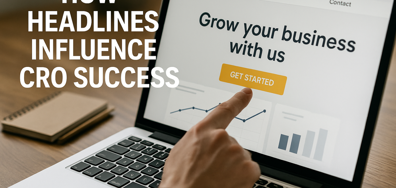
A high-converting above the fold landing page usually includes a clear headline, a short supporting sentence, a visible call to action, relevant visual context, and one credibility cue. That credibility cue might be social proof, a review count, a client logo, a security badge, a guarantee, or a specific result.
Above the fold content is different from a hero design. A hero design is a visual layout. Above the fold content is the conversion argument users see first. A beautiful hero can still fail if the headline is vague, the CTA is buried, or the message match is weak.
Why Above-the-Fold Content Is Crucial for CRO and User Experience
Above-the-fold content is crucial for CRO because users evaluate relevance before they evaluate details. If the first screen does not answer “Is this for me?” the rest of the page may never get read.
The first visible screen affects four conversion behaviors. It influences bounce rate, scroll depth, click-through rate, and form starts. When the page opens with a clear promise, users are more likely to continue. When it opens with vague copy, slow-loading visuals, or no clear next step, users hesitate.
This is especially important for paid traffic. A user who clicks a Google Ads, Meta Ads, LinkedIn Ads, or email campaign already has a specific expectation. If the landing page above the fold does not match the ad, the message match breaks. That friction can reduce lead generation, ecommerce conversion, demo requests, and trial sign-ups.
WordStream defines conversion rate optimization as improving landing pages and website design to increase the percentage of visitors who complete a desired action. That desired action starts with the first screen. If users cannot understand the offer quickly, they are less likely to complete the action.
The fold is also where user experience and CRO overlap. Strong above the fold content makes the page feel easier. It reduces cognitive load. It tells users what the brand does, why it matters, and what to do next.
The Dreamer Designs 8-Point CRO Audit Framework for Above-the-Fold Content
The Dreamer Designs 8-Point CRO Audit Framework helps us review the first screen as a conversion system, not a design decoration. The goal is to make the first screen clear, credible, fast, and action-oriented.
1. Make the headline instantly specific
Your headline should tell users what you offer, who it is for, and why it matters. A vague headline like “Grow Faster With Better Solutions” forces users to guess. A specific headline like “Turn Paid Ad Clicks Into More Qualified Demo Calls” gives users a reason to stay.
For above the fold CRO, headline testing is often the highest-leverage starting point. Test benefit-driven headlines against problem-aware headlines. For example, a SaaS landing page may test “Reduce Churn With Real-Time Customer Health Alerts” against “Stop Losing Customers You Could Have Saved.” Quick win: read the headline out loud without the page context. If someone cannot tell what the offer is, rewrite it.
2. Match the first screen to the traffic source
Above-the-fold content should continue the promise that brought the user to the page. If the ad says “Free Shopify CRO Checklist,” the first screen should repeat that offer clearly. If the email promotes a webinar, the hero should not lead with a generic company pitch.
Message match is one of the simplest ways to reduce bounce rate and increase conversion intent. A landing page above the fold should reflect the keyword, ad angle, audience pain point, and offer language. This is especially important for Google Ads and paid social because users compare what they clicked with what they see next. Quick win: place your ad headline and landing page headline side by side. If they feel disconnected, align them before changing the design.
3. Put the primary call to action where users can see it
A visible call to action helps users understand the next step without searching. That does not mean every visitor will click immediately. It means the page clearly communicates what action is available.
For short offers, the CTA may work best directly in the first screen. For complex offers, the above-the-fold CTA can invite a lower-friction action such as “See How It Works,” “Get the Free Audit,” or “View Pricing.” CXL notes that CTA placement should follow the logic of the page, not a rigid rule, because some users need more persuasion before converting. Still, the first screen should make the next step obvious. CXL’s landing page guidance emphasizes clear CTAs and persuasive landing page structure.
Quick win: check your page on mobile. If the CTA is hidden below a large image, oversized headline, or navigation menu, tighten the layout.
4. Add one trust signal before asking for action
Above-the-fold content should reduce doubt before asking users to convert. A trust signal helps visitors believe the offer is real, relevant, and safe.
Strong trust signals include client logos, review counts, star ratings, security badges, refund guarantees, press mentions, certification badges, case study results, or clear privacy language near a form. Social proof works best when it is specific. “Trusted by 500+ ecommerce brands” is stronger than “Trusted by businesses everywhere.”
Quick win: add one proof element near the CTA, not buried near the bottom. For a lead generation page, this could be “No credit card required,” “Response within 24 hours,” or “Used by 200+ founders.” For ecommerce conversion, it could be “4.8-star average from 1,200 reviews” or “Free returns within 30 days.”
5. Keep the first screen visually focused
The above-the-fold area should guide attention, not compete for it. Too many badges, buttons, nav items, popups, videos, animations, and text blocks can overwhelm the user before the offer is understood.
A focused first screen usually has one main headline, one supporting sentence, one primary CTA, one optional secondary CTA, and one visual that supports the message. The visual should clarify the offer. For SaaS, that might be a product screenshot. For ecommerce, it might be the product in use. For a service business, it might be a result, transformation, or simple process graphic.
Quick win: remove anything above the fold that does not help users answer one of three questions: “What is this?”, “Why should I care?”, or “What should I do next?”
6. Design for mobile first, not desktop approval
Most teams review landing pages on desktop because it is convenient. Users often experience them on mobile, where the fold is smaller, the CTA can drop lower, and form friction becomes more obvious.
Mobile optimization changes above the fold content. Long headlines wrap into five lines. Hero images push CTAs down. Sticky headers take up space. Popups can cover the offer. A page that feels clean on desktop can feel crowded on mobile.
Google’s PageSpeed Insights reports user experience on both mobile and desktop and gives suggestions for improvement. Google also describes Core Web Vitals as metrics for loading, interactivity, and visual stability, which all affect the first visible screen.
Quick win: review your first screen on at least three mobile sizes. Make sure the headline, CTA, and proof cue are visible without awkward scrolling.
7. Use behavior data to validate the first screen
Heatmap and session recording data show whether users actually see, read, click, and scroll from the first screen. This matters because internal opinions about design often differ from real user behavior.
Use Microsoft Clarity or Hotjar to review clicks, scroll depth, rage clicks, dead clicks, and mobile behavior. Microsoft Clarity describes itself as a free user behavior analytics tool with heatmaps and session replays, while Hotjar describes heatmaps as a way to see where users click, move, and scroll.
Quick win: watch five session recording clips from mobile visitors who bounced. If they pause, scroll up and down, tap non-clickable elements, or abandon before the CTA, the first screen needs clarity.
8. Test the fold as a conversion hypothesis
Above-the-fold optimization should be tested like any CRO hypothesis. Instead of saying, “We need a better hero,” define what you believe will change user behavior.
A strong hypothesis might be, “If we move the CTA above the fold and add review proof next to it, more mobile users will start the form because the next step will feel clearer and safer.” Then measure CTA clicks, scroll depth, form starts, completed leads, and conversion rate.
Use A/B testing when traffic volume is enough to compare variants. Use split testing for major layout changes and multivariate testing only when you have enough traffic to test multiple elements responsibly. Quick win: test one major change at a time, such as headline, CTA placement, hero image, or proof element.
For deeper testing and funnel tracking, connect the page to a full CRO dashboard so you can review user behavior, conversion funnel progress, and landing page optimization opportunities in one place.
Above-the-Fold CRO Mistakes That Hurt Conversions
Most above-the-fold mistakes happen when teams design for visual impact instead of decision clarity. The first screen must persuade quickly, not just look polished.
A vague headline that could fit any company
Generic headlines are common because they feel safe. Phrases like “Unlock Growth,” “Scale Smarter,” or “Transform Your Business” sound polished but do not explain the offer. Users should not need to scroll to understand what you do.
Fix this by making the headline specific to the audience, pain point, and outcome. For example, “Book More Qualified Sales Calls From Paid Traffic” is clearer than “Optimize Your Growth Engine.” A clear headline supports CRO because it reduces mental effort immediately.
A CTA that appears too late
If the first screen does not show a clear CTA, users may not know what action the page wants them to take. This is common when teams use oversized hero images, large navigation bars, or long intro copy before the button.
Fix this by making the primary CTA visible early, especially on mobile. The CTA should use action language tied to the offer, such as “Run My Free Audit,” “Get the Checklist,” “Start My Trial,” or “Book a Strategy Call.” Avoid vague CTAs like “Submit” or “Learn More” unless the action truly is educational.
Too many competing actions
A landing page should not feel like a homepage. When the first screen includes a full navigation menu, multiple buttons, social icons, video links, newsletter prompts, chat widgets, and exit intent popups, users face too many choices.
Fix this by prioritizing one conversion goal. If the page is built for lead generation, the above-the-fold CTA should support that goal. If the page is built for ecommerce conversion, the first screen should guide users toward product evaluation or purchase intent. A landing page design service can help simplify the page around one action instead of many distractions.
Slow-loading hero content
Above-the-fold content loses power when it loads slowly. Heavy images, background videos, animations, custom fonts, and third-party scripts can delay the headline or CTA. That delay creates a page speed and user experience problem before copy can do its job.
Fix this by compressing the hero image, removing unnecessary scripts, limiting above-the-fold animation, and checking Core Web Vitals in Google Search Console. Google’s Core Web Vitals report uses real-world usage data to show how page groups perform.
Proof that appears too far down the page
Many pages hide testimonials, reviews, case studies, and trust badges far below the fold. That forces users to consider the CTA before they see a reason to trust the brand.
Fix this by placing a small but meaningful proof element near the first CTA. This does not have to be a long testimonial. A logo row, star rating, short quote, customer count, certification, or result-based proof point can be enough to reduce hesitation.
Designing the fold without checking heatmap data
Teams often debate above-the-fold layout internally without looking at real user behavior. That leads to design decisions based on preference instead of evidence.
Fix this with a heatmap, session recording, and Google Analytics 4 event tracking. Look at whether users click the CTA, ignore the visual, try to click non-clickable images, or scroll before reading the headline. Then optimize based on behavior, not opinions.
CRO Tools That Help Improve Above-the-Fold Content
The right CRO tools help you see the first screen from three angles: clarity, performance, and behavior. Use tools to diagnose the problem before redesigning the page.
The Dreamer Designs CRO Analyzer should be the first tool you use because it reviews above-the-fold clarity, CTA visibility, page speed, trust signals, mobile layout, and form friction from a conversion perspective. It helps you see whether the first screen is built for action or just visual appeal.
Google PageSpeed Insights helps you find technical issues that affect the first visible screen. Use it to review mobile and desktop performance, render-blocking resources, image weight, and Core Web Vitals.
Google Search Console helps you identify Core Web Vitals patterns across your site. This is useful for WordPress templates, Shopify landing pages, blog pages, and campaign pages that share the same layout or code.
Microsoft Clarity helps you understand user behavior with heatmaps and session recordings. Use it to see whether visitors engage with your above-the-fold CTA, scroll past the hero, or abandon before interacting.
Hotjar gives you heatmaps, recordings, funnels, and feedback tools to understand where users click, move, scroll, and drop off. This is useful when the page looks good but the data suggests users are missing the main message.
Unbounce publishes conversion benchmark data based on large landing page datasets, including more than 41,000 landing pages, 464 million visitors, and 57 million conversions. That scale makes benchmarks useful as directional context, but your own conversion rate benchmark should still be based on your traffic source, offer, audience, and funnel.
If your campaign pages are built in Unbounce and the first screen feels cluttered, a dedicated Unbounce landing page design process can help improve CTA hierarchy, mobile layout, page speed, and A/B testing structure.
How to Optimize Above-the-Fold Content for Different Landing Pages
Above-the-fold content should change based on the offer, traffic source, and level of buyer awareness. The same layout will not work for every conversion funnel.
For SaaS landing pages
SaaS pages should make the product category and outcome clear immediately. Users need to know what the software does, who it helps, and why it is better than the current workflow. Use a benefit-driven headline, a product screenshot, a CTA like “Start Free Trial” or “Book a Demo,” and proof such as customer logos or G2-style ratings.
For SaaS CRO, avoid leading with feature overload. The first screen should sell the result, while the lower page can explain workflows, integrations, security, pricing, and use cases.
For ecommerce landing pages
Ecommerce pages should show the product, value proposition, price context, and buying confidence quickly. Shopify landing pages often fail when large product images push reviews, offer details, or CTAs too far down the mobile screen.
Place the product benefit, review proof, return policy, shipping hook, and CTA close together. If the product requires education, use the first screen to create interest and the next screen to explain details. For ecommerce conversion, trust and speed are as important as product photography.
For lead generation landing pages
Lead generation pages should explain the offer and reduce form friction before asking for information. If users are expected to book a call, request a quote, download a guide, or start an audit, the first screen should make the value of that action clear.
Avoid long forms above the fold unless the offer is very high intent. For lower-intent traffic, a two-step form can sometimes reduce friction because users first click a CTA before seeing form fields. Track form starts and completions in Google Analytics 4 to see where users hesitate.
For WordPress service pages
WordPress service pages often include too much navigation, too many plugins, and broad homepage-style messaging. For CRO, the first screen should focus on one service, one audience, and one next step.
Use a clear headline, short supporting copy, one CTA, and one proof cue. Remove unnecessary sliders, auto-playing videos, and plugin-heavy visual effects. The page should feel fast, focused, and credible.
For Unbounce campaign pages
Unbounce pages are often built for paid campaigns, which means the first screen must align tightly with ad intent. Use the keyword, offer, or campaign promise in the headline. Keep the CTA obvious and test hero variants with A/B testing.
Because Unbounce pages are frequently duplicated across campaigns, small improvements to above-the-fold content can scale quickly. Test message match, hero image, CTA copy, and proof placement before testing deeper design changes.
Questions Buyers Ask About Above-the-Fold CRO
These are the questions marketers, founders, and ecommerce teams often ask before redesigning a landing page above the fold.
What is above-the-fold content on a landing page?
Above-the-fold content is everything users see before they scroll. On a landing page, this usually includes the headline, supporting copy, hero visual, CTA, navigation, and any visible trust signals. The fold changes by device, so the goal is not one perfect desktop layout. The goal is to make the first screen clear and persuasive on mobile, tablet, and desktop.
Why is above-the-fold content important for CRO?
Above-the-fold content is important for CRO because it shapes the user’s first decision: stay or leave. If the first screen clearly explains the offer, matches the traffic source, shows trust, and presents a visible call to action, users are more likely to continue through the conversion funnel. If it is vague or cluttered, bounce rate usually rises.
Should the CTA always be above the fold?
The primary CTA should usually be visible above the fold, but users may not click it until they understand the offer. For simple offers, an above-the-fold CTA can drive immediate action. For complex offers, the first CTA may work better as a soft step, while later CTAs convert users after more proof. Test CTA placement with heatmap data, A/B testing, and click-through rate tracking.
What should be above the fold on a landing page?
A landing page above the fold should include a specific headline, short supporting copy, one main CTA, relevant visual context, and one trust signal. Depending on the offer, it may also include a form, star rating, customer logo row, product image, or short testimonial. Avoid cramming every detail into the first screen. The goal is clarity, not density.
How do I know if my above-the-fold content is working?
You know your above-the-fold content is working when users stay, scroll, click, and start the desired action. Use Google Analytics 4 to track CTA clicks and form starts. Use Microsoft Clarity or Hotjar to review heatmap and session recording data. If users ignore the CTA, abandon quickly, or scroll without engaging, the first screen likely needs stronger copy, proof, or layout hierarchy.
Does above-the-fold content affect SEO?
Above-the-fold content can affect SEO indirectly through user experience, page speed, mobile usability, and content clarity. Google’s Core Web Vitals focus on loading, interactivity, and visual stability, which often affect the first screen. A strong above-the-fold experience can also help users engage with the page, but SEO still depends on relevance, content quality, technical health, and authority.
How much text should be above the fold?
Above-the-fold text should be short enough to scan and specific enough to persuade. Most landing pages need one clear headline, one supporting sentence, and a CTA. If the offer is complex, use concise language that earns the scroll instead of explaining everything at once. The first screen should reduce confusion, not answer every possible objection.
Should social proof be above the fold?
Yes, at least one form of social proof should appear above the fold when possible. This could be a review count, customer logo, star rating, short testimonial, trust badge, or result claim. Social proof helps reduce doubt before users click the CTA or fill out a form. Keep it compact so it supports the offer without overwhelming the first screen.
Is above-the-fold content more important on mobile?
Yes, above-the-fold content is often more important on mobile because the visible area is smaller and users are quicker to abandon confusing pages. Long headlines, oversized images, sticky bars, and popups can push the CTA below the first screen. Mobile optimization should make the headline, CTA, and trust signal visible quickly while keeping page speed strong.
What is the best way to test above-the-fold content?
The best way to test above-the-fold content is to start with one hypothesis. Test the headline, CTA copy, CTA placement, hero image, trust signal, or form layout. Use split testing for major layout changes and multivariate testing only when traffic volume is high enough. Combine test results with heatmap, session recording, and conversion rate data to avoid judging by clicks alone.
Above-the-Fold Content Turns Attention Into Action
Why above-the-fold content is crucial for CRO is simple: the first screen decides whether users understand, trust, and continue. It is where message match, headline clarity, page speed, trust signals, social proof, mobile optimization, and CTA hierarchy come together.
A strong above-the-fold area does not need to say everything. It needs to say the right thing first. In our audits of 200+ landing pages, the best-performing pages make the offer obvious, show proof early, load quickly, and give users a clear next step.
Start by reviewing your first screen on mobile and desktop. Then check user behavior with heatmaps, session recordings, and analytics. If the page feels unclear, slow, or visually crowded, improve the top screen before rewriting the full page.
For a faster diagnosis, run a free audit and see whether your above-the-fold content is helping or blocking conversions.